Have you ever seen anything that was so unusual that you could not help but rub at your eyes and take a closer look? It seems impossible that you are truly seeing this with your own two eyes. You probably wonder, “How did this even happen?”
The Baskin Robbins Logo
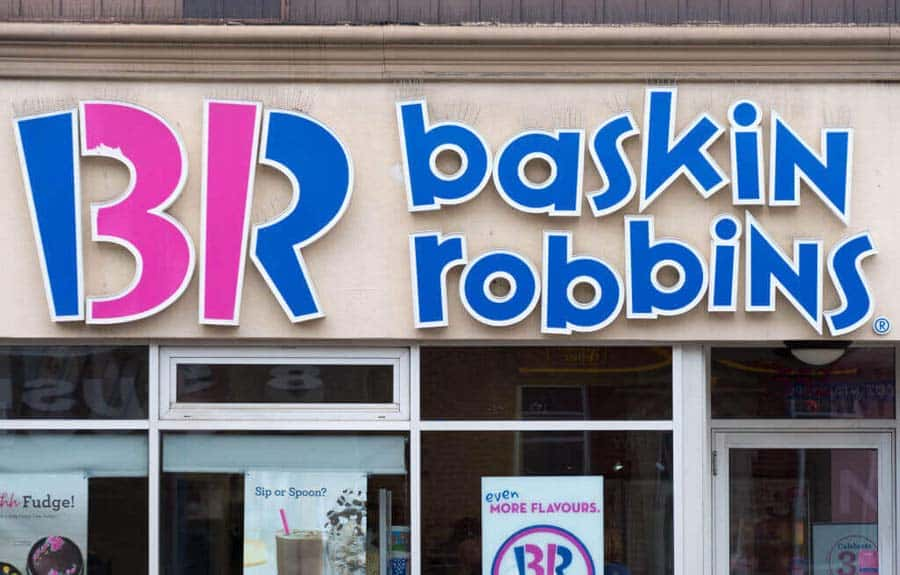
We all love the ice cream from Baskin Robbins, but did you know that its logo is even more creative than you thought? The fun font and colors account for part of it. It evokes a certain childish wonder in anyone who sees it! However, there is a secret message hiding in there.
The Baskin Robbins Logo
The color-blocking technique makes it even more childish, although it is also used to hide the “31” in the logo! The number stands for the original flavors that the company offered upon opening in 1948. To this day, they still want to emphasize those 31 flavors. Another fun fact is that Baskin Robbins was the first store to offer samples. Where would we be if they had not introduced that?
The Pittsburgh Zoo Logo
At first glance, you might think that the Pittsburgh Zoo is fairly simple. What is so special about a tree surrounded by flying birds? While we have to admit that it is pretty outdoorsy and perfect for a zoo, it is nothing particularly spectacular. That is until you spot the lion and gorilla faces embedded in the logo.

The Pittsburgh Zoo Logo
If you saw the two animal faces right away, good job. But did you also spot the fish jumping out of ‘water’ at the base of the tree? This is the logo that keeps on giving. Check out how one of the most recognized brands in the world evolved their clever logo over time.
The Tour de France Logo
We all know that the Le Tour de France logo is pretty funky. If you are not familiar with it, this is a cycling race that happens in France for three weeks. The logo is abstract, modern, and attractive. However, many people fail to see the image hidden in the stylized “tour” on it.

The Tour de France Logo
The yellow circle in the logo stands for two things. On a more obvious note, it stands for the trademark yellow jerseys the winners win. However, it also has a less obvious meaning. Look closer and you might see that, together with the “O” in “tour”, it shows a man riding a bicycle! This ingenious logo was debuted in 2003 for the centennial anniversary of the race. Isn’t it powerful?
The Amazon Logo
Amazon is now a billion-dollar company, but its logo has never lost the sense of brilliance that helped its profits balloon over the years. It is a groundbreaking e-commerce site that offers practically anything we could ever want. This is why there’s an arrow that goes from A to Z!

The Amazon Logo
To be fair, the logo has undergone certain revisions over the years. The first iteration of the logo was introduced in 1994 after Jeff Bezos launched the company. Back then, it primarily sold books. Four years later, it got a facelift after the business started to dabble in things outside of books as well. In 2000, the company finally started to expand the products it offered and introduced the current version of the logo that we now know.
The Toyota Logo
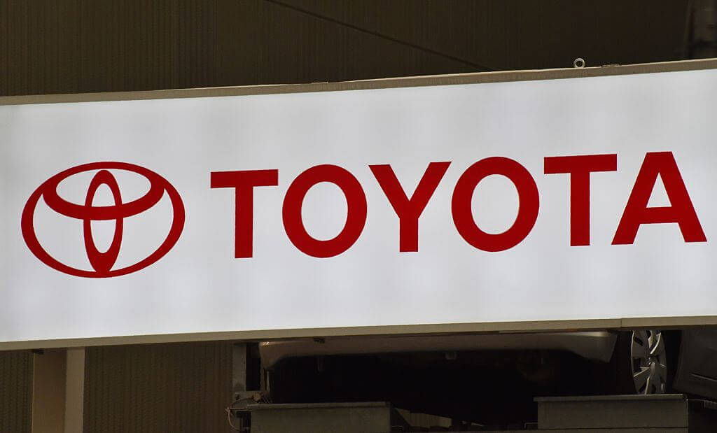
There has been lots of debate about the logo of this Japanese car brand. Still, we can all agree that there is more to it than meets the eye. If you want to hear the official explanation, its three ellipses “symbolize the unification of the hearts of our customers and the heart of Toyota products. The background space represents Toyota’s technological advancement and the boundless opportunities ahead.”
The Toyota Logo
However, there are various theories and speculations surrounding the logo as well. Some think it looks more like a thread passing through the needle eye. Perhaps this is a way to pay tribute to the textile industry beginnings of the company. That does not sound impossible to us whatsoever!
The FedEx Logo
Just like Amazon, FedEx is one of the biggest companies out there right now. The logo is recognizable even though it is simple. Who would have thought that there was something so unexpectedly brilliant about it? Have you ever noticed how the negative space between “x” and “E” make up an arrow?

The FedEx Logo
The company first debuted all the way back in 1971. At the time, it was using a different logo. It was only in 1994 that it was introduced after a rebranding. If you ask us, they definitely made the right choice! Apparently, it was meant to represent “speed and accuracy.”
The Hershey’s Kisses Logo
We have yet to meet anyone who does not like Hershey’s Kisses! While there is nothing unusual about the logo of Hershey’s itself, there is something intriguing about the logo of this particular product of theirs. The “K” and “I” in the logo form a space shaped just like a chocolate Kiss! How cool is that?

The Hershey’s Kisses Logo
Similar to the negative space of the FedEx logo, the presence of this kiss goes unnoticed by most, but can’t be unseen once it’s discovered. While the logo is relatively recent, the shape of a Hershey’s kiss hasn’t changed since 1907, so it looks like this logo may be timeless.
The BMW Logo
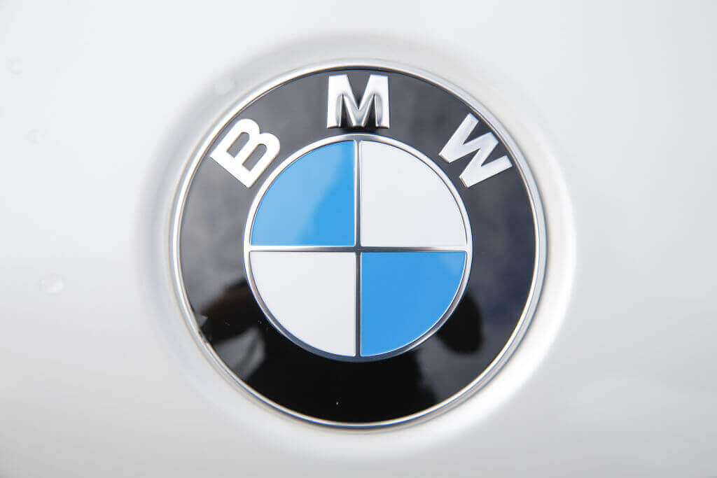
The BMW logo has long been a controversial one. There are two top theories people like to argue about. Some people speculate that the blue and white colors are meant to represent a propeller because the company got its start as a post-WWI engine manufacturer.
The BMW Logo
Meanwhile, the other theory is that the colors are meant to pay homage to the flag of Bavaria because the company got its start in the German state. Hey, who said it couldn’t mean both things at once? At any rate, this is an iconic logo that works.
The LG Logo
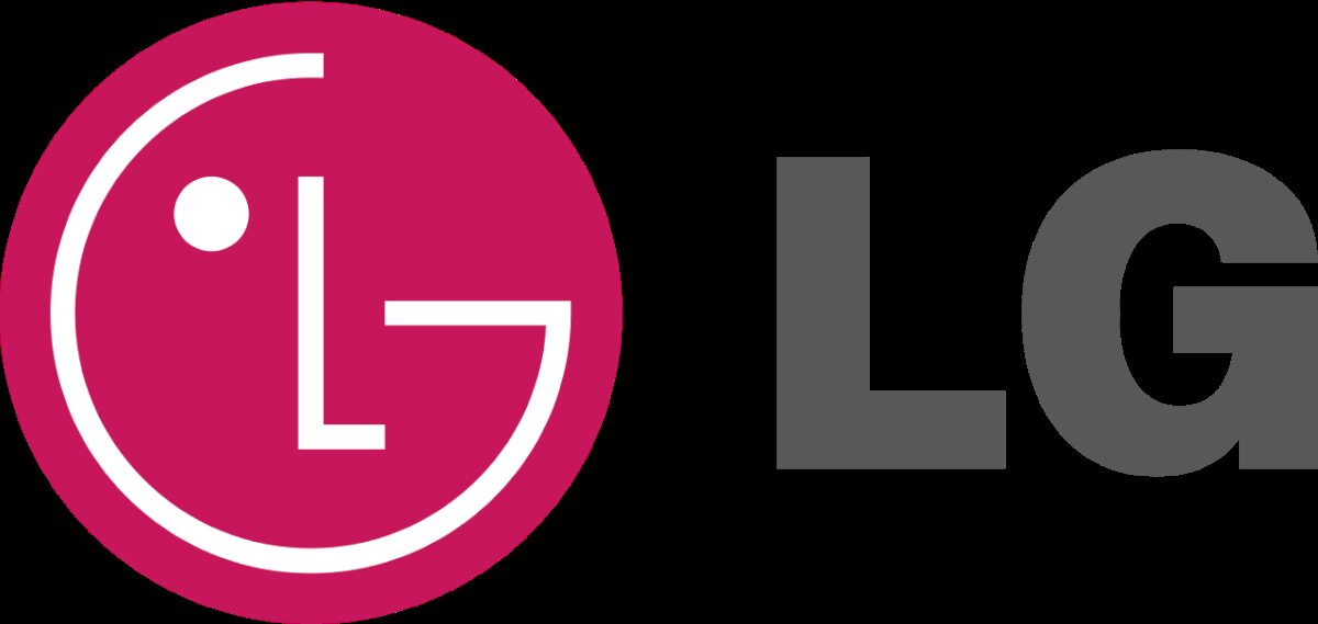
If you take a single glance at the logo for LG Electronics, it probably looks just like a winking face. However, a closer look will show you that the “nose” is actually an L, while the “face” is a “G”.
The LG Logo
Fans have also said that the dark pink logo looks kind of like Pacman.
The Gillette Logo
It is not hard to appreciate subtle logos and subliminal messages. Often, a lot of thought has gone into the designs. Take the Gillette logo for example.
The Gillette Logo
The “G” and “I” in the first part of the logo come with negative spaces that look just like razors! While it is a new addition, people were quick to notice it.
The Delta Airlines Logo
There is nothing all that mind-blowing in the logo used by Delta Airlines. However, it is still worth mentioning that the logo uses the Delta symbol, the fourth letter in the Greek alphabet.

The Delta Airlines Logo
Aside from that, it also represents the roots of the airline. Hailing from the Mississippi Delta region, it is perfect. Not only that, but the white lines on the logo suggest the wings of a plane, particularly those of the DC-8. It was the first jet aircraft of the airline company.
The Hidden Mickey
No, you are not looking at a photo of a grass Mickey Mouse spot. You might think it is nothing more than a dirty tile floor, but there is more to it than that.

The Hidden Mickey
There are times when you can only appreciate a spot from a certain angle. We doubt you would be able to appreciate it from anywhere else! The effort that went into its creation is pretty intense.
Hiding Another USB Port
Who would have thought that your singular USB port might be hiding a twin inside the unit? It turns out that it is cheaper to make a single model, package them differently, and then market them individually!

Hiding Another USB Port
Now that you are armed with this info, you should check your USB ports for hidden features like this.
Can’t Unsee It
Can you imagine just how many times you have enjoyed a Toblerone bar in your life? And yet not once did you notice that a bear is hiding in the mountain in the logo!

Can’t Unsee It
We are sure that you will never forget this from now on. This is not something that you can unsee.
The Goodwill Logo
There are a lot of good reasons to shop second-hand. It is better for the environment, and you might find some awesome vintage stuff. If you already do this, we bet you are familiar with the Goodwill logo.

The Goodwill Logo
However, we bet you have not noticed the hidden symbolism in it before. It is easy to see the smiling half-face in there, but have you ever noticed that the white face is supposed to be a “G” as well? Cool!
Sasquatch Sighting
Is it Bigfoot or a sasquatch? We could never tell them apart. Let us just say that it is a mix of the two. While this is much smaller than the image we have in our heads, but it is still pretty cool.

Sasquatch Sighting
There is no need for alarm, folks. You will only truly spot it if you knew where to look!
The Perfect Cam-flauge
There are plenty of times when cameras are placed in pretty obvious locations. This does not make a lot of sense to us since evildoers will know what spots to avoid if they do not want to get caught on camera!

The Perfect Cam-flauge
Here is a solution to a problem like that. This is a great way to keep your camera hidden in plain sight.
Robots And Scarves
Look at this scarf for a long enough time and you will start to see robots. If you want to make your significant other a handmade gift, this is a better idea than plain old sweatshirts!

Robots And Scarves
Scarves are awesome because they are versatile yet stylish. Robots only make them that much better.
Where’s Waldo But Worse
This is making us lose our minds! Can you find the hidden phone in here? Is this someone’s idea of a terrible joke? Finding Waldo is pretty hard, but this just takes the finding game to a whole new level.

Where’s Waldo But Worse
All right, we have found it at long last. Return to this when you have finally given up and admitted defeat. No dice? It’s beside the right leg of the table!
Not Narnia
While you were cleaning the garden, you suddenly stumble into this shed for the first time in your life.

Not Narnia
You have never seen it before, so could it be possible that it just popped out of nowhere just now? Don’t get your hopes up just yet because we doubt Narnia is in there.
School Sheep
We are pretty sure that this new student did not go through admissions as one should! We do not know who brought this sheep with them to the lecture, but we are impressed he sneaked the animal in.

School Sheep
Do you have any idea just how long it would take before this furry friend starts eating notes for dinner?
The Wolf Within
When fences come with a design, it can often be described as pointless and random. However, this fence is not like most fences out there! For one thing, it has an awesome but subtle hidden design.

The Wolf Within
We are sure you will agree that this is cool. Honestly, we think companies should start doing this!
A Secret Passage
As a kid, I used to fantasize about putting up secret rooms in my house. That’s why the Admont Abbey Library in Austria is so fascinating. The library looks great on its own already, but this is something else.

A Secret Passage
This would make it so much easier to sneak into the library! If you can’t sleep, snuggle up with a book!
Dice In Unexpected Places
This might look a little odd, but it makes a lot of sense when you consider the weight of chess pieces.

Dice In Unexpected Places
They are typically heavier at the bottom to offer support, right? Well, this method is one way to go about it! Don’t go smashing around any of your other toys now.
The Cigarette Man
We do not know if you smoke, but we bet even people who favor the Philip Morris brand is unaware of this. Not a lot of people check the end of the butt before popping a stick into their mouth, after all.

The Cigarette Man
Unexpected Bathroom Window
If someone went number 2, this is going to help a lot. Doesn’t this look fairly easy to accomplish all by yourself? All you have to do is to attach the hinges and the mirror frame using the screws.

Unexpected Bathroom Window
Cueballs Or Jawbreakers
It must have been an intense round of billiards for this to happen! At least we can see what’s inside.

Cueballs Or Jawbreakers
Can’t Find The Entrance
The Press is a sandwich shop in Shanghai. It might be hard to spot if you didn’t know what to look for!
Why? For one thing, the entrance to the deli is this old-fashioned Coca-Cola vending machine. Yup, you need to pull it open if you want to go in and grab a sandwich. How cool is this?

Can’t Find The Entrance
Why? For one thing, the entrance to the deli is this old-fashioned Coca-Cola vending machine. Yup, you need to pull it open if you want to go in and grab a sandwich. How cool is this?
An Underground Lair
We have always wanted to give the superhero lifestyle a try, right? This is one way to accomplish that.

An Underground Lair
This expensive vehicle deserves a grand entrance. The arrangement certainly makes it feel like this is the Batcave! Is Batman taking his trusty car to defeat the Joker? That certainly sounds possible.
What Lies Underneath
People normally throw a pair of dice, right? Often, we do not really give it a lot of thought. When you break it, take a peek inside because you might find something you never expected… like another pair of dice!

What Lies Underneath
The downside here is that you probably bought a pretty low-quality dice. Oh well, at least it will still do in a pinch!
This National Park In Montana
This is the Glacier National Park located in Montana. Isn’t it the most beautiful thing you have ever laid your eyes on? This pristine body of water is the epitome of tranquility and relaxation.

This National Park In Montana
The water itself could have come from an Impressionist painting. We would love to see this amazing spot with our own two eyes. We are sure it is even more beautiful in person.
Hidden Celtic Cross
This 328-foot Celtic cross close to the UK border was recently discovered by a couple of plane passengers. Apparently, a man called Liam Emmery planted it six years before his death!

Hidden Celtic Cross
If you want our opinion, this is a pretty great tribute. We do not doubt that he loved his country.
Nothing Inside
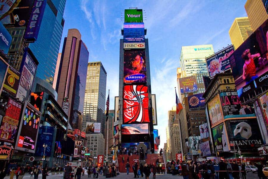
Believe what you want, but there is nothing inside the iconic One Times Square building! This is pretty unbelievable when you consider just how much chaos happens around it on Times Square.
Nothing Inside
The company that previously owned this landmark filed for bankruptcy in 1992. It was later purchased by an advertising company that only wanted to use it for ads and billboards.
Below The Hustle And Bustle
Did you know that there is a huge labyrinth of tunnels running underneath the hustle and bustle of Las Vegas? It is home to hundreds of homeless people. It is very dark in there, but it is definitely not empty.

Below The Hustle And Bustle
As soon as you switch on a light source, you will discover that there is a whole community in there.
Just A Floor Above
The 102nd floor lookout platform of the Empire State Building is no secret whatsoever. However, not a lot of people know about what exists just one floor higher.

Just A Floor Above
On the 103rd floor, there is a small room with a balcony. Sadly, it is exclusive to VIPs and staff members.
Secret Rooms in Disney World
You should know that the Cinderella Castle you will find at Disney World is not only for show! There is more to it than just a venue for picture-taking. What else is hiding in this building?

Secret Rooms in Disney World
There exist secret rooms in there where people pay to stay in! Mind you, they are pretty swanky places.
Light Lookout
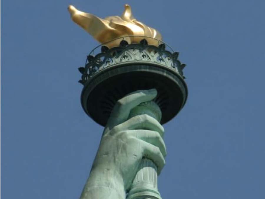
Before 1916, there used to be a staircase that went up to the balcony located in the torch at the Statue of Liberty. Sadly, it suffered a lot of damage after an explosion.
Light Lookout
After the incident, people were no longer given access to the area. In 1986, they built a replacement.
The Impostor
Look at this photo. We doubt that you would not have noticed something amiss about it if you walked past it. However, a closer look will have you in a giggling fit.

The Impostor
This cute guy is the right color and size. However, he was clearly made of a different material.
A Tiny Police Station
You will find the smallest police station in the famous Trafalgar Square in London.

A Tiny Police Station
The Lilliputian Police Station comes with a phone line that connects it straight to Scotland Yard. If they were to hold prisoners in there, they would have to limit it to only two people.
A Great Hiding Spot
Whoa, we bet people with even marginally bad eyesight would not notice this owl in the tree trunk!

A Great Hiding Spot
With its peepers closed, he looks nothing more than a chunk of tree bark. We are sure this is his preferred way to keep predators away and sleep the night away. What a smart little cookie.
How To Sneak A Drink
If you are trying to sneak some moonshine in a no-alcohol zone, this is the product that you need.

How To Sneak A Drink
No one would ever suspect that a brush is hiding alcohol in it. The only way someone will be able to tell is if you pull it out and start drinking from it. If your hair is a mess, you can use it to get rid of tangles too.
Mt. Rushmore Secrets
Mt. Rushmore is best known for the faces of the presidents, but did you know there is more to it?

Mt. Rushmore Secrets
Behind the head of Abraham Lincoln, you will find a hidden room called the Hall of Records? This is the where you should go if you want to hear the story of this country as well as the charter documents.
Movie Magic
This is a screencap from the Disney animated film called Brother Bear. If you look closely, you will see Nemo of Finding Nemo himself! What is he even doing all the way there?

Movie Magic
It is not a coincidence. In fact, Disney is well-known for throwing in Easter eggs like this one all the time.
Eiffel Tower Secret
The Eiffel Tower is awe-inspiring enough on its own, but did you know that there is a secret apartment in one of the most iconic landmarks in the world?

Eiffel Tower Secret
In 1889, Gustave Eiffel added a private apartment in his creation. He was the only person who could access it back then. It recently underwent restoration. They even added wax models to the unit!
Hidden Gun Compartment
This one goes out to all the gun enthusiasts reading this article. If you want to feel secure by keeping a gun in the house, you should make sure you put it somewhere safe.

Hidden Gun Compartment
You can’t go wrong with secret compartments like this one! It will make you feel like a gangster too.
Airport Discovery
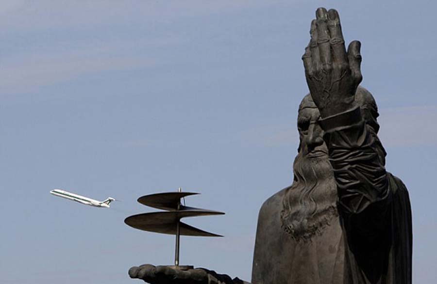
You cannot possibly miss the 60-foot Leonardo da Vinci statue at the Fiumicino-Leonardo da Vinci Airport in Rome. Even though it was opened in 1960, people only found this secret hatch in 2006.
Airport Discovery
Inside the hatch were parchments that detail the history of this area. They were even written in Latin! There was also a list of the people who attended the opening ceremony.
Not Your Hose
Even snakes know that one should hide in plain sight. Be careful – you might mistake this guy for a hose!

Not Your Hose
While the mistake is understandable, it is in your best interest to avoid snake bites. You don’t want to end up in the hospital, do you?
Good Hiding Spot
Burglars might go into your house and look for things they could take with them. However, we doubt that they would ever find this hidden safe! No one has the time to pry open wooden panels, after all.

Good Hiding Spot
This is where you should keep the most valuable things you have in the house. Brilliant!
Sly Stapler
It seems like the person is one who likes to push his limits. If you want to hide things, this is one way to go about it.

Sly Stapler
Let us just hope that no one else will try to use this for a very long time. Otherwise, he might get caught!
Camouflage Perfection
Whoa, this is pretty amazing. Is that a ghillie suit or is it an invisibility cloak? If you did not know there was a person in this picture, you would never have suspected it.

Camouflage Perfection
Next time you are on a hike, you might want to keep your eyes peeled for lurkers in the bushes.
How To Save Space
Have you joined in on the tiny home craze? People are now turning to minimalism and simple living. We can see the appeal, especially now that consumerism has become so overwhelming!

How To Save Space
If you are a big fan of the trend, you should take inspiration from this photo. Washing machines and dryers are bulky pieces of equipment that take up a lot of room. Multitasking is the key!
Hide A Key Here
People traditionally hide a spare key below the welcome mat. However, this idea is not the smartest thing to do.

Hide A Key Here
Instead, you should follow in the footsteps of the guy who came up with this trick. We doubt that people will suspect there is a hidden house key in here! It is not only simple but also very effective.
