The FedEx Logo
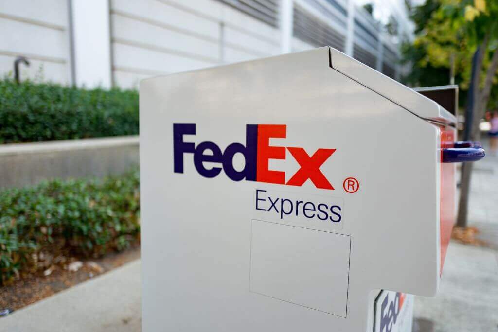
Just like Amazon, FedEx is one of the biggest companies out there right now. The logo is recognizable even though it is simple. Who would have thought that there was something so unexpectedly brilliant about it? Have you ever noticed how the negative space between “x” and “E” make up an arrow?

The FedEx Logo
The company first debuted all the way back in 1971. At the time, it was using a different logo. It was only in 1994 that it was introduced after a rebranding. If you ask us, they definitely made the right choice! Apparently, it was meant to represent “speed and accuracy.”
The Hershey’s Kisses Logo
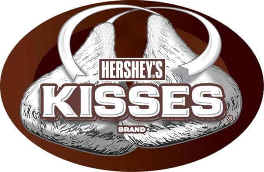
We have yet to meet anyone who does not like Hershey’s Kisses! While there is nothing unusual about the logo of Hershey’s itself, there is something intriguing about the logo of this particular product of theirs. The “K” and “I” in the logo form a space shaped just like a chocolate Kiss! How cool is that?

The Hershey’s Kisses Logo
Similar to the negative space of the FedEx logo, the presence of this kiss goes unnoticed by most, but can’t be unseen once it’s discovered. While the logo is relatively recent, the shape of a Hershey’s kiss hasn’t changed since 1907, so it looks like this logo may be timeless.
